pose

Crafting Video-centric Shopping Experience

INtroduction

I shaped a fashion e-commerce app delivering video-centric shopping experience where users find inspiration through product and promotional videos. As the sole designer leading the end-to-end design process, I transformed this concept into a complete design while overcoming key design and technical challenges along the way.

iOS
e-Commerce
End-to-End
my role

Responsible for end-to-end process including concept development, IA, wireframing, UI design, prototyping, user testing

the team

Product Designer, Service Designer, Project Manager, Front & Back end Engineers

design timeline

Feb - April 2023

client research
Understanding business model and goals

Before diving into user research, it was crucial to understand the overall service ecosystem and the client’s needs to build a successful product. We began by discussing the business model and objectives during the kick-off meeting.

Business model diagram to structure a product

clients needs
01
Focus on video-based content

Based on the insight that video content drives higher conversion rates, the client aimed to make video a main feature throughout the entire shopping journey.

02
Encouraging user-generated content

Given that reviews strongly influence purchasing decisions, the client wanted to motivate users to contribute more content to the review section.

03
Minimal interface

To avoid visual overload from video content, the client wanted to ensure the interface remained minimal, highlighting only essential elements.

user scenarios
Discovering opportunities

After gathering insights about our target users, I developed user personas and scenarios then facilitated an ideation workshop with the client and the service designer. This process helped identify opportunities at every stage of the user journey.

Virtual scenario-mapping workshop on Figjam

design strategy
Strategic thinking to guide the entire design

I established a design strategy that guided the entire design process across the app. This helped the team and me stay focused on high-level goals to deliver a simple and intuitive shopping experience.

Utilising existing design patterns and gestures to reduce learning curve and create intuitive shopping experience

competitor research
Researching on design patterns

To understand which patterns and gestures users find familiar when browsing video content, I conducted extensive research on existing products both within and outside the industry. This insight helped shape the interface and interaction design for key features.

Exhaustive competitor analysis by pages, services and features, including +30 apps across the world

design process
From main features to entire design

Since video content is central to this product, the project manager developed a roadmap beginning with the core question of how to effectively showcase the videos, which then expands to the entire pages. I’ll highlight key areas below including content, product, and main pages.

content page
Utilising familiar interaction and design patterns
wireframing
Sketching out features

After identifying the essential features and functionalities to be showcased in the video content, I created wireframes to effectively integrate them into the interface.

prototyping
Exploring interaction design and product display

After creating wireframes, I developed prototypes to test which interaction best supports both content swiping and browsing related products, then discussed with the client to decide what product information should be displayed at this stage.

High-fidelity prototypes to effectively communicate with stakeholders.

user testing
Validating assumption through testing

The client assumed that "Users will be more likely to swipe content horizontally." while I assumed they would prefer to swipe vertically. To validate our assumptions, we decided to give users a task - explore the next video content - without indicating the swipe direction.

the result
87% of the participants swiped vertically

I found that 13 out of 15 participants (87%) swiped vertically, mentioning that it was not difficult to understand how to move on to the next video as the interface felt similar to social media apps like TikTok. This suggests that vertical swiping is the more intuitive gesture for them.

product page
Determining essential elements based on quantitative research
problem
Excessive PDP length

Korean shopping apps always include a long editorial section below the product gallery, pushing reviews and product suggestions too far down. While the client wanted to remove this section, I felt it was important to assess its value first.

survey
56% of participants said they still find the detail section helpful

I conducted a short survey to understand how valuable users find the editorial section. While the results showed it supported their purchase decisions, users also found the detailed content overwhelming. This led to a key question 'How might we present the editorial section more concisely without losing its value?'

design exploration
Structuring key content for better navigation

I broke down the PDP into three key elements—basic product information, the editorial section, and reviews—and explored various ways to present them effectively without adding unnecessary depths or extra pages.

the result
Essential yet informative

Through design iterations, I introduced tabs to help users quickly switch between key sections of the PDP. This cut the average page length by 60% compared to competitors, and made the review section more accessible. Users also responded positively, mentioning navigating through product information is much easier.

main page
Solving technical issue through design
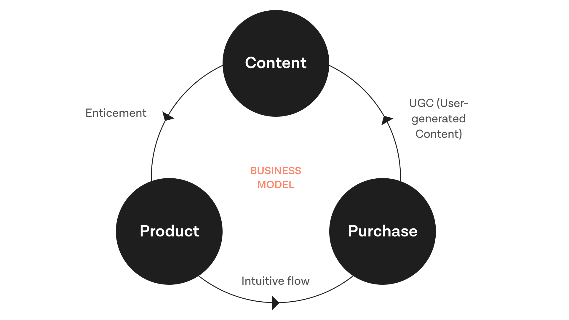
problem
Technical issue - Slow loading times

During a demo, I noticed that high traffic was causing slow loading times, which could negatively impact user experience. While technical fixes were necessary, I also believed that design could help mitigate the issue by optimising content delivery.
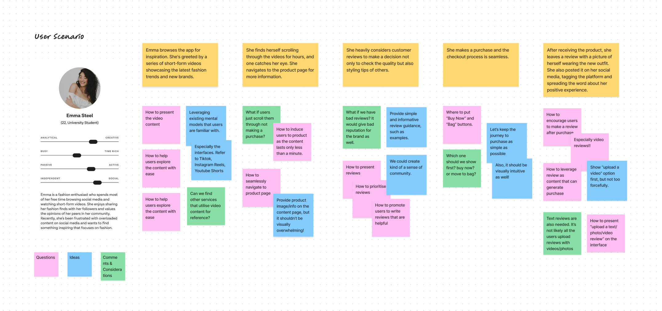
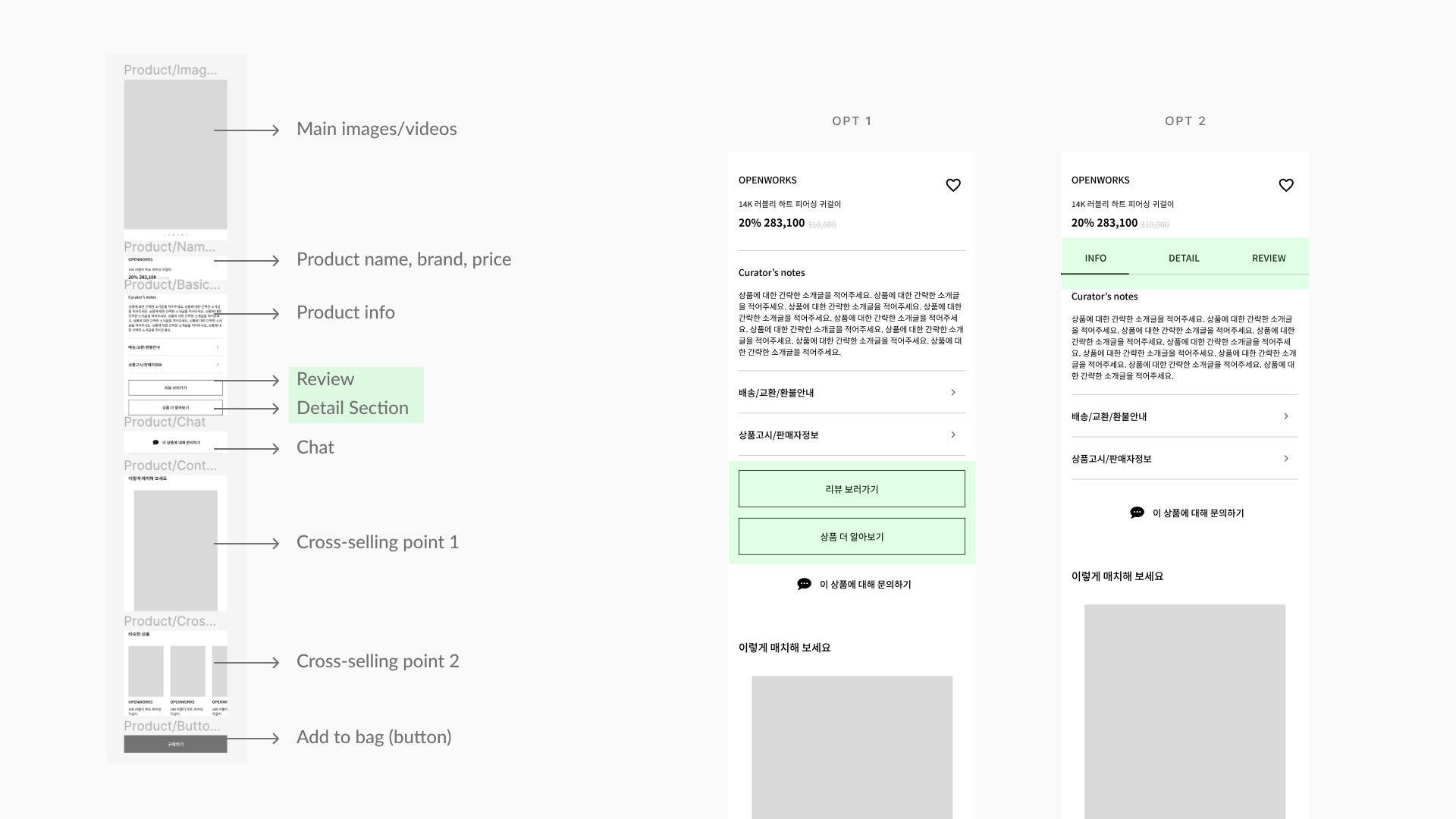
ideation
How might we make users 'feel' like the loading is fast?

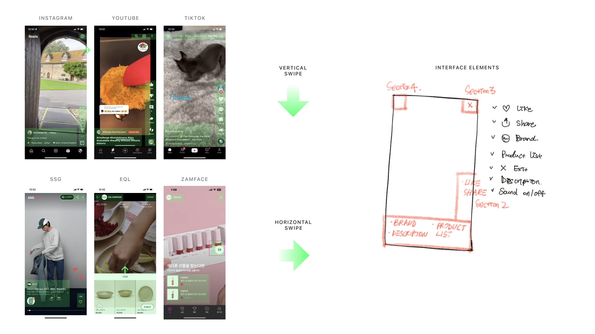
To address the loading issue, I explored lazy loading techniques to reduce the amount of data the browser needed to process at once. I then quickly developed an interactive prototype to validate the technical feasibility of this approach.
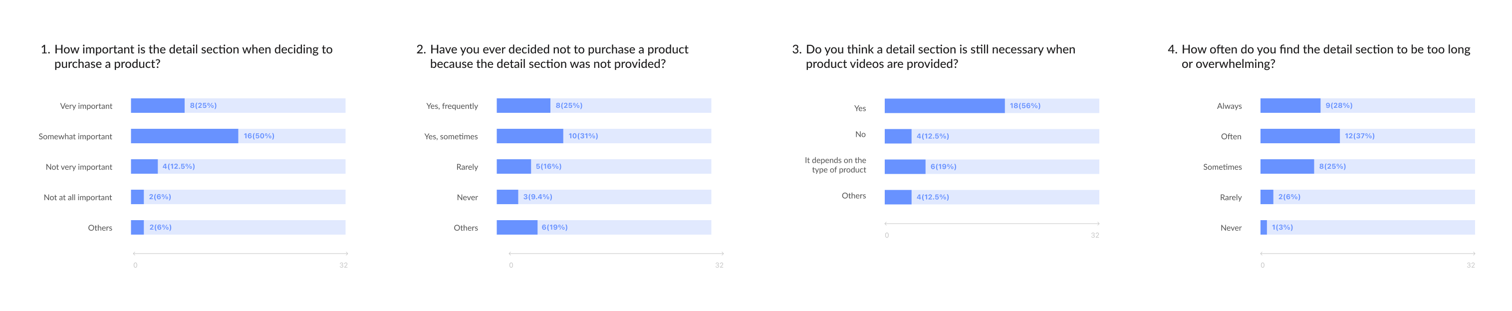
the result
Improving performance through design

By implementing this approach, loading times were noticeably reduced, resulting in quicker access to content and a more seamless user experience.

learnings
Working agile in a squad team

Collaborating in an agile squad deepened my understanding of teamwork and iterative workflows. This setup encouraged open communication and swift adaptation to change.

Building trust between stakeholders

Building trust between stakeholders is essential. I fostered this by sharing user testing insights that supported my design decisions while respecting the client’s industry expertise. High-fidelity prototypes also helped me bring concepts to life, making the stakeholders easier to understand and collaborate on.

Client Research
User Scenarios
Strategy
Competitor Research
Design Process